
Branding
Branding for Observatorio ecoED
One of the key priorities for a successful brand is a consistent presentation that is immediately recognisable. Introduction Observatorio ecoED seeks to research, develop and promote environmental, ecological and regenerative teaching approaches and practices centred on nature and communities through innovation and intentionality. The logo The symbol combines three elements: a plant shoot with a…
One of the key priorities for a successful brand is a consistent presentation that is immediately recognisable.

Introduction
Observatorio ecoED seeks to research, develop and promote environmental, ecological and regenerative teaching approaches and practices centred on nature and communities through innovation and intentionality.
The logo
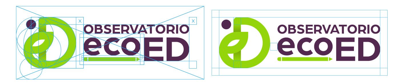

The symbol combines three elements: a plant shoot with a leaf, connecting us to ecology; a snail, symbolising both the golden ratio and the slow but steady progress of education and research; and a pencil, reinforcing Observatorio ecoED‘s work in education. The first two elements are stylised to form the letters ED.


Colour palette

Green is the identity’s main colour and appears in the brand’s most visually prominent elements. Dark violet complements it, adding weight, balance, contrast and legibility, which is why it is used in the logo’s typography.
Green connects us with nature and ecology, while violet connects with femininity and the caring tasks traditionally associated with the earliest stages of human education.
Photos, images and photographic treatment
Photography is a key part of the identity, and colour should always complement the image. To achieve this, choose the palette colour closest to the communication piece’s subject and specify each image’s colour treatment.
