Branding
Rebranding for aprĕn guatemala
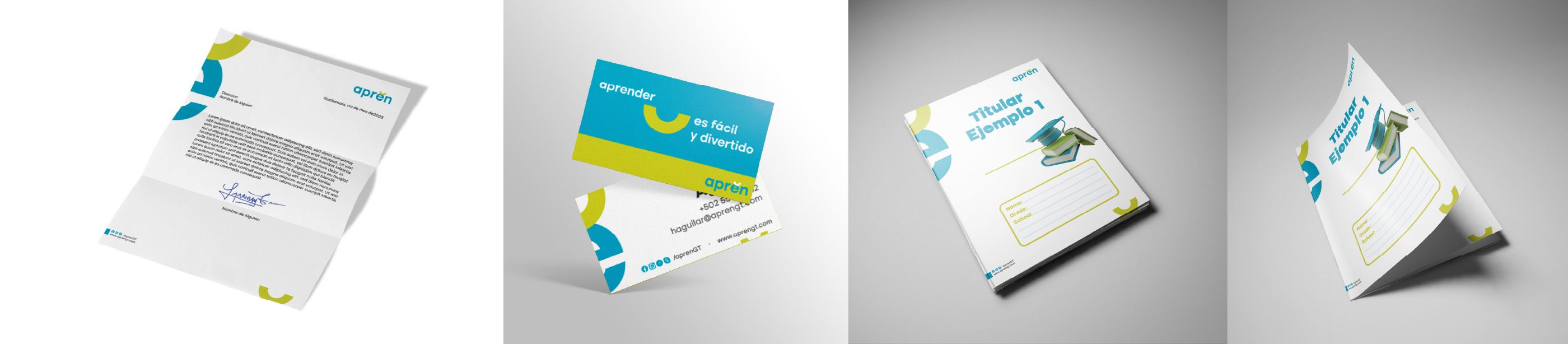
Redesigning and renaming English 4 All as aprĕn: an innovative, modern approach to learning.
Redesigning and renaming English 4 All to introduce an innovative, modern approach to learning: aprĕn.
Introduction
In this case study, we share our experience redesigning and renaming ‘English 4 All’ to create a refreshed identity with greater impact. We examine the challenges facing the previous brand, the reasons for change and how we effectively conveyed its new approach to fun, accessible learning.
We want to highlight the importance of a strong brand strategy and how a well-executed redesign can significantly influence a company’s perception and appeal in the market.
The original brand
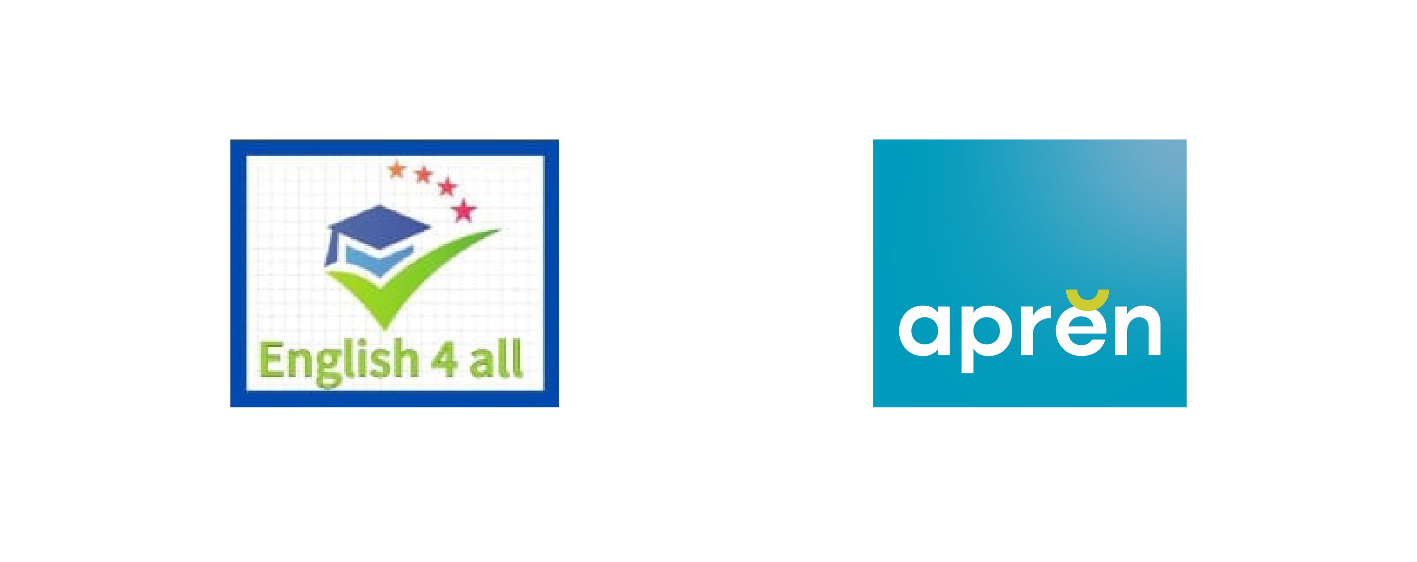
When the English 4 All team approached us, we identified significant challenges. The existing brand did not adequately convey its current identity and lacked impact and attention. Although it offered English classes in person and online, it did not reflect its evolution towards an academy offering broader services, including tutoring, refresher courses and languages. A change was needed to improve its positioning in a highly competitive market.
Reasons for change
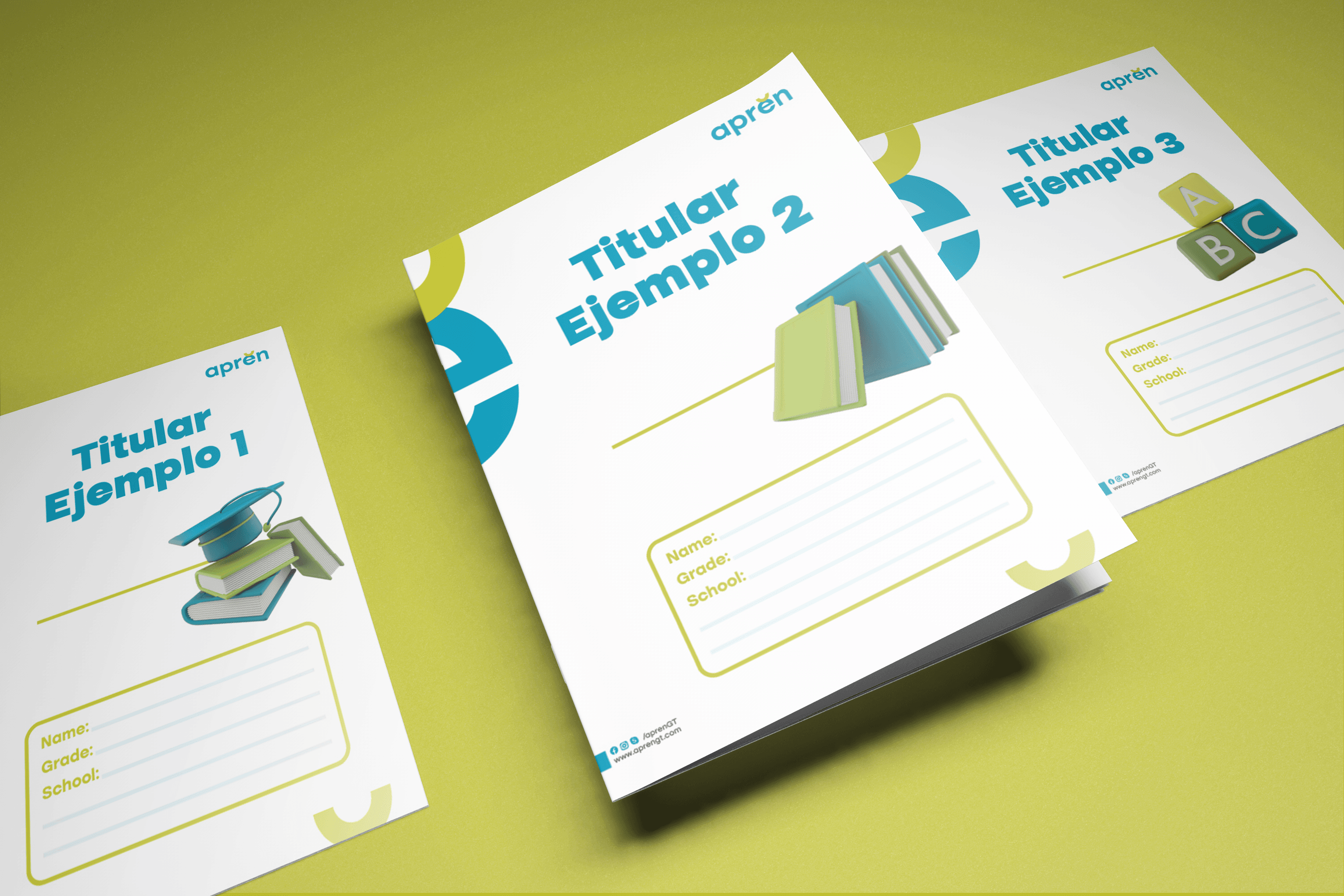
Several reasons motivated the change. First, we needed to communicate the academy’s distinctive proposition effectively: learning can be fun and accessible, setting it apart from a conventional academy. The previous brand also failed to attract its target audience or stand out in a saturated market, leading us to seek a more impactful, eye-catching identity.
The redesign
To address these challenges, we implemented a complete brand redesign, including a name change. We worked closely with the academy’s team to understand its vision and goals and develop an effective brand strategy.
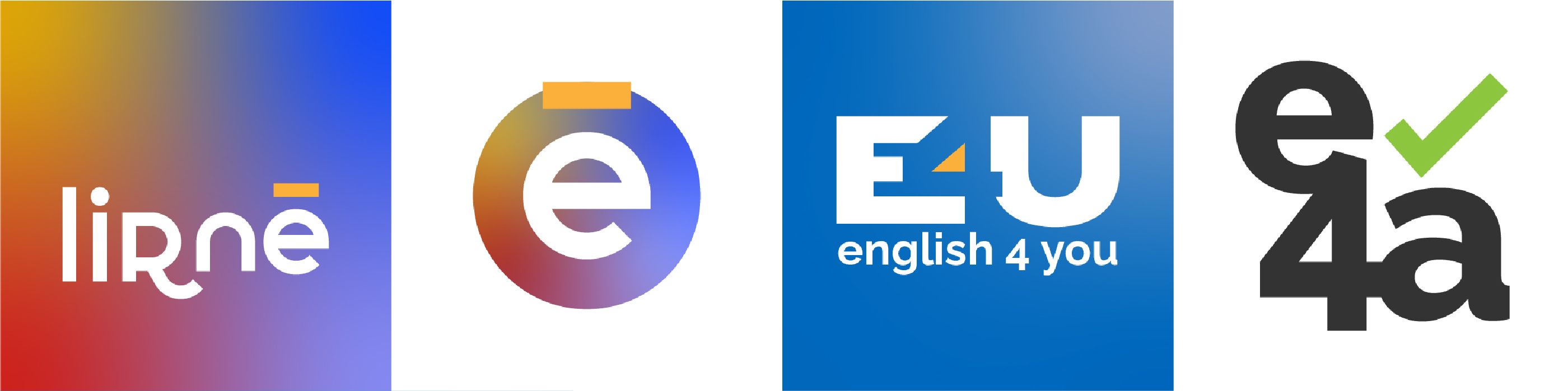
We explored different naming directions, from retaining the original name to considering words based on the English word ‘learn’ and its linguistic origins. A visual direction led us to the possible name ‘lirnē’, from Middle English ‘lernen’ and Proto-Germanic ‘liʀnōn’. We used its phonetic spelling as a graphic distinction.
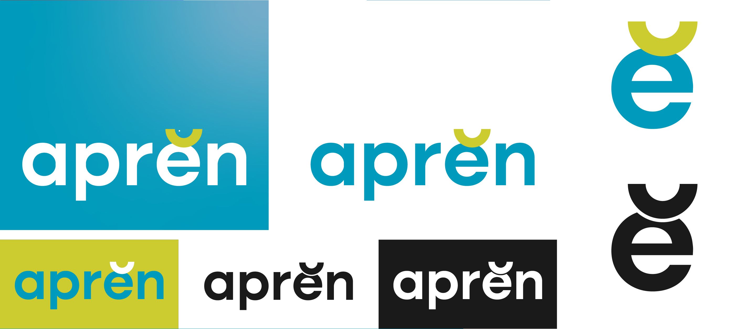
These paths gradually led us to the final name, ‘aprĕn’. The choice was based on an in-depth analysis of the learning process, which requires effort from students to complete it.
We left aprĕn unfinished so that a Gestalt response would prompt the brain to complete the missing ending, conveying the brand’s essence unconsciously. Visually, we drew on phonetic writing, using the breve accent as a distinctive sign and visual anomaly in the logo. It creates graphic tension through form, colour and position.
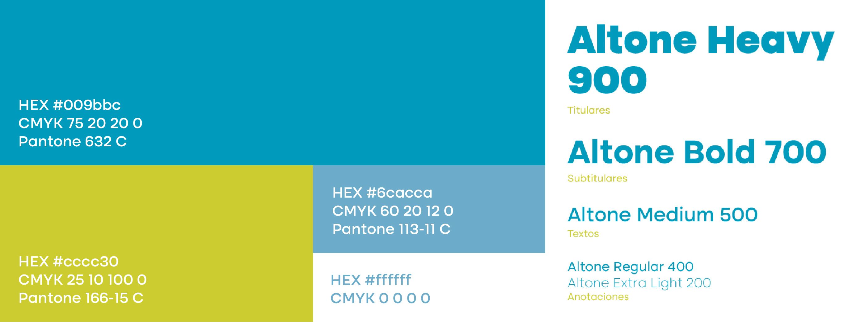
This redesign strategy produced a name and visual identity that convey our innovative, accessible learning proposition. The breve accent and bright green and cyan colours stand out in the market, attracting the target audience and expressing our vision of dynamic, effective learning.